My Final Design


My Eclipse Moment
Above are the final colored design and the line art for my eclipse project. I decided to stick with some of my original ideas, but to add in some new bits as well. The elements I wanted to showcase were: the moon phases, the Chicago skyline, the Chicago flag (demonstrated with stars, but also in the use of color), the eclipse glasses, and the eclipse itself.I used multiple reference photos, here are the links to the work I used:

https://www.nasa.gov/johnson/HWHAP/total-eclipse-over-america
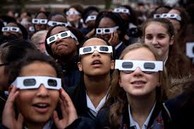
https://www.space.com/36941-solar-eclipse-eye-protection-guide.html

https://commons.wikimedia.org/wiki/File:Flag_of_Chicago,_Illinois.svg

http://www.velgos.com/media/10602580-4bf0-4208-96c9-8c35a54065cf-chicago-skyline-silhouette-panorama-photo

https://www.shutterstock.com/image-vector/moon-phases-icons-astronomy-lunar-symbols-474953233?src=gA3Yiy40749PwGK9_h6nLg-1-51
Complimentary

Greyscale

Monochromatic

FINAL

Comments
Post a Comment