

Above are my final "profile picture" and "cover photo" designs.
I experimented with a lot of different color harmonies and variations of this design (I will post those below), but I decided on this color combination for a multitude of reasons. I think the color harmonizes well, and I also think the feeling you get from these colors is closer to the feeling I wanted my portrait to convey. Also, the over all color combination kind of emulates "fall", which is my favorite season.
The cover photo was my favorite part of this assignment. I started with the idea of hands. Hands are the means of physical creation and because i'm an artist, I felt this was a natural connection. Also, the hands contain symbols and ideas from creations I am inspired by or feel associated with.
I wanted to include my love for books (and general nerd things) by including Dr. Manhattans symbol from my favorite comic, the deathly hallows symbol from the harry potter series, and little twenty sided dice you see scattered in the background to showcase my love for roleplaying games. Then comes my love for astrology showcased in the signs of conjunction, venus (this also has a double meaning to me in regards to female empowerment, the impact it has on my artwork, and generally being a feminist), and the moon.
Then comes the pentagram and the peace sign, which to me have very similar means in regards to how I associate to them. Many people see pentagrams and assume evil, but I really love pentagrams. To me, I associate them to the spiritual connection we all have to the elements.


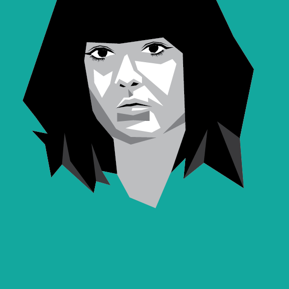
These are the two variations of self portrait designs i've made. I'll be honest in saying that this project was a bit frustrating for me. While I am a studio arts major, this is my first time working with digital types of design. It's all very new to me. I wanted to create something more geometric and angular than my last design to test out different stylized versions of working digitally. I used two different reference photos because I wasn't sure which one worked better. Above are the two end results and below are the two reference photos used.


Self Portraits
What is vector art?
Vector art is composed of lines, points, and shapes. It is mathematically created so it can be scaled or resized and never lose it's quality or become pixelated.
The difference between self portraits and selfies?
Self portraits are a way of portraying the self, which doesn't always have to be a clean-cut picture of your face. To me, you can personify a self within a self portrait whereas, with a selfie, it is just a picture of the purely physical you. Self portraits to me, should have depth.
Five portrait artists that I find influential and inspiring?
Francesca Woodman
A contemporary artist specializing in portrait photography. Her work is an unsettling and beautiful look into a broken mind.


Nan Goldin
Contemporary artist who takes portraits and candid photos showcasing a harsh reality.


Cindy Sherman
Contemporary artist who used her self portraits to play on the stereotyped women we see often portrayed in film and the media.


Jenny Saville
Contemporary artist who creates unsettling, unflattering portraits of herself and other women as a counter to the abundance of male artist who portray women to be ultimately feminine and lovely.


Karen Kilimnik
Contemporary artist who makes portraits of herself but also various celebrities as a way of mocking our celeb obsessed society.


Overall, your self-portrait is amazing. The color scheme of your portrait and your cover compliment what you are trying to convey to the viewer. With your hair , my recommendation would be to add a little highlights to your hair to make the image pop out. Everything else is great!
ReplyDeleteI think the color scheme you picked was a great choice. It is very warm and inviting and contrasts well. I think you did a nice job combining many different things about you in the background without it being too busy. The simplicity of your project is very eye catching and appealing. The only minor idea I have for your piece is that I noticed the hands all are right hands except for one. Maybe flip another hand to balance it out a little.
ReplyDeleteI like how your portrait gives a pop art, cubism feel to it, while still looking realistic. It reminds me of an alternative rock album cover. I think how you did the project is a very unique perspective. You could tell that you put a lot of work into the project by doing multiple variations. The only improvement I would make is to add a little more detail to the eyes.
ReplyDelete